Eight UX rules I keep using for AI-powered apps
The handful of decisions that keep coming up when I design AI apps. None are clever. They're the ones that matter when real users actually start using the thing.
Designing regular software is mostly about laying things out clearly and making interactions predictable. AI apps don’t work that way. The output is non-deterministic. Responses take seconds to arrive. The model sometimes refuses, or wanders off, or is confidently wrong.
After working on a handful of AI products, I keep coming back to the same eight decisions. None of them are clever. They’re the ones that turn out to matter when real users show up.
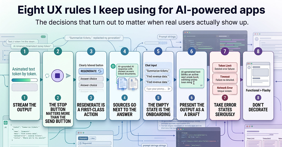
1. Stream the output.
Four seconds of spinner feels broken. The same four seconds of text appearing token by token feels fast. People read what’s already on screen while the rest is generating, and that’s where the speed comes from. Not from making the model faster.
Implementation is the easy part. Most LLM APIs hand back a stream of tokens via server-sent events. You pipe them through to the UI. The trickier part is making sure the surrounding layout doesn’t reflow with every word that arrives. Reserve vertical space for the response before content starts. Lock heights where you can.
2. The stop button matters more than the send button.
Models spiral sometimes. The user asks something, the response gets it wrong in the first sentence, then keeps elaborating on the wrong answer for twenty more seconds. The user just wants to stop and try again.
Put stop in the same spot as send. Swap them while a response is generating. Don’t bury it behind an icon nobody recognizes. The action of cancelling should be at least as easy as the action of asking, because users will need it more often than you’d expect.
3. Regenerate is a first-class action.
LLMs give different answers to the same prompt. The first one might be wrong, the second might be perfect, the third might be useless. That isn’t a bug. It’s how the tool works.
Surface regenerate as a clearly labeled button next to the response. If users have to retype their whole prompt to try again, they will, which is slower and worse. The frequency of regenerate clicks is also one of the better signals you have for whether a particular workflow is performing.
4. Sources go next to the answer.
If your AI is grounded in something (documents, search, structured data), the references need to be visible without clicking. Tooltips and side panels are too hidden. By the time users notice a sources panel exists, they’ve already decided whether to trust the response.
Without visible sources, users have two options: trust blindly or distrust everything. Neither is a healthy relationship with a tool they’re supposed to be using daily.
5. The empty state is the onboarding.
The first thing a new user sees is a blank text field. That blank field is doing most of your onboarding whether you designed it to or not. The user doesn’t know what to ask, doesn’t know what the tool is capable of, doesn’t know how specific to be.
“Ask me anything” is the worst possible answer. It throws the user back at the blank page they were trying to escape. Show example prompts that are specific to what users in this product typically need. “Summarize the support tickets from this week.” “Find rows where revenue dropped.” Concrete starting points let users adapt instead of invent.
6. Present the output as a draft.
AI output is almost always edited before being used. If your UI presents the response as a polished, complete thing (a finished email with a send button right next to it) you signal that the AI is in control. If you present it as text with the cursor already inside, ready to be tweaked, you signal that the user is.
A tiny detail that changes how the entire interaction feels.
7. Take error states seriously.
AI apps look fine when they work. They look terrible when they don’t. Token limit gets hit mid-response. Rate limit kicks in. Network drops. Model returns nonsense. The API times out.
Each of these needs a designed state. A generic “Something went wrong” tells the user nothing useful. If your app has fewer than five distinct error states for AI failures, you haven’t really shipped it. You’ve shipped the happy path.
8. Don’t decorate.
The temptation with AI features is to lean into the visual novelty. Glowing borders, animated gradients, a pulsing dot somewhere to signal “intelligence.” Resist.
The AI is doing the interesting work already. The UI’s job is to stay out of the way. The AI apps that age well are the ones that look almost boring. Calm, fast, focused on the actual task. The ones with dramatic visual flair tend to feel dated within months of shipping.